We might start with some generic basics, that’s true. But on the way, you’ll find lots of visualizations and examples that are highly specific to aviation industry KPIs.
Let’s dive right in.
Contents
(1) The Fundamentals
(2) Basic Visualization
(3) Advanced Visualization
(4) Lists and Texts
(5) Geo Mapping
(6) Timelines
(7) More Information Design for Airline Dashboards
The Fundamentals
Chapter 1
No one wants to dig through tons of data records. Or to read page-long reports. Especially if they only need to grasp the current overall situation quickly. This is where the visualization of data and KPIs kicks in.
What Data Visualization is all about
Data visualization means to sum up (lots of) data into one visual, e.g. as a KPI. The challenge is to keep the information easy to understand. At the same time the design should attract attention.
To achieve this, the first question must always be: What is the information to be shown?
And: Who is the audience?
It is, in fact, the audience that determines how to present information. For management, condensed information is most suitable. Business experts, in contrast, need more details.
What Data Visualization is not about
I experience it far too often that design is discussed first. Then it’s like, “I saw this cool chart. We should have this, too. “Or “Bar charts are lame. “
That’s not the point.
The point is that this cool chart probably does not convey the information that is needed. The traditional bar chart probably does.


By the way: This is why I prefer not to call it data visualization. I call it information design. Information is key. Design follows.
Basic Data Visualization
Chapter 2
Most KPIs are simple numbers that sum up certain events (e.g., number of departures or cancellations). Often, they are also determined proportionally (e.g., the OTP of all departures).
To be clear: Being simple is their strength.
It makes them easy to grasp for anybody.
So, don’t hide clear information in detailed visuals. Instead, use one of the following basic chart types to get your message across straight away.
Already feel confident in using the basics? Then quickly jump into the next chapter. But be aware: You might miss some inspiring real-life examples.
# 1 Counter
You have defined your KPI set. With your airline KPI dashboard, you want to show if you’re performing well or not.
Use a counter.
Counters are suitable for the visualization of exactly one KPI in a bold, unmissable way. Ideally, you combine it with a reference value (e.g., the year’s daily average). Or you add the daily trend.


As you can see, counters benefit hugely from color-coding. Is the KPI above the reference, or is the trend positive? The green color will directly show you. Is something going wrong? In this case, nothing attracts as much attention as a red counter.
# 2 Donut
Another way to display one single KPI is donuts. They are not as eye-catching as counters. However, thanks to its unique shape, value changes in a donut are easier to track and evaluate.
Consider choosing donuts over counters if your KPI can reach a maximum. This is the case for
- goal fulfilment tracking (e.g. 34 of 90 flights departed).
- KPIs measured as percentages (e.g. otp at 79.3%).


The last example shows how clearly reference values can be added to donuts: Target, average, the previous value, forecast, … You name it.
And donuts can do even more for you.


Use a donut on your airline KPI dashboard to display categories (e.g., delay minutes by reason). Or try to track goal fulfillment in multiple layers. We lovingly call this visual “The Onion. “
# 3 Bar Chart
Stick to segmented donuts if you want to see how much of the total is formed by a segment.
Switch to a bar chart to better compare the segments with each other. Or if you want to add a second dimension (e.g., delay minutes by reason at different stations).
The example clearly shows the different effects:


You can immediately see that aircraft issues make up the most significant part of the total delay in the donut. On the other hand, the bar chart shows more clearly that weather (not airline operations) has the second most significant impact. The stacking bar chart states: While aircraft caused delays to appear everywhere, the weather is only a problem in London.
# 4 Column Chart
In some cases, it is indeed a matter of taste whether a column chart or a bar chart is chosen. Nevertheless, both have their unique advantages:
Use a column chart for negative values. For example, people associate the downward direction more easily with negativity. Similarly, time tickers are better perceived along the x-axis.
However, column charts are not suitable for long data labels.


# 5 Line Chart
The line chart excels in representing trends. Everyone quickly understands the ups and downs of the line.
Therefore, use a line chart on your airline KPI dashboard to highlight how strongly a value rises or falls over time.


# 6 Combining Line and Column Chart
Our pro tip for basic visuals is to combine a column chart with a line chart to put KPIs into context.
For example, you can better assess the development of on-time performance if you include the average delay per flight. Thus, a lack of punctuality is perhaps not as critical as it seems when delays are short.

Advanced Data Visualization
Chapter 3
We talked about the audience before. Some people need more information than just plain numbers.
They need relations and more details, which help them to react to the numbers.
With the following advanced data visuals, you can:
- break down your KPIs to different objects (e.g. aircraft types, stations, …).
- make direct comparisons between these objects.
- display the results concentrated on the essential.
- derive your next necessary action steps.
# 7 Radar Chart
Radar charts or spider charts are extra suitable for tracking top-level targets and quality improvements. Each axis tracks a KPI. Typically, the goal is to achieve the highest value on all the axes. The result is a filled radar chart.

The example above displays the performance of ground processes. Catering and cleaning perform pretty well. However, fueling and loading must be improved.
# 8 Bubble Chart
For me personally, the bubble chart is the holy grail when it comes to process optimization. It only takes one glance to find out what is hindering you from reaching your goals.
This is what you need to know to set up this killer chart:
- Your goal (e.g. the optimization of the fleet maintenance process).
- A main KPI that represents this goal (e.g. aircraft downtime).
- Factors, that influence your goal (e.g. aircraft type, rate of planned and unplanned events).
- Reference values that help you evaluate these factors (e.g. number of departures).
And this is what you get:
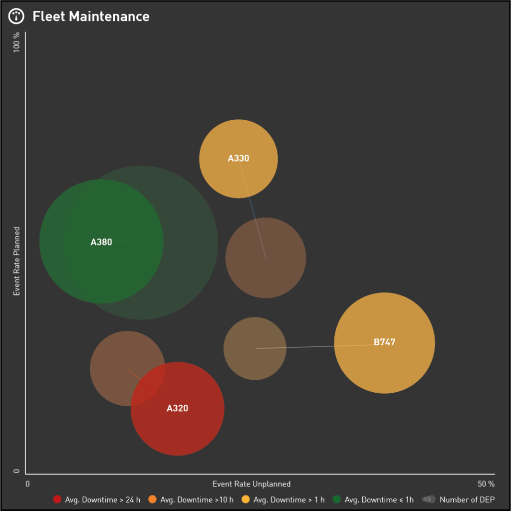
In this example, you want all your bubbles to be on the chart’s left side (i.e., no unplanned events). Shining in green (i.e., short aircraft downtimes).
But that’s not the case for all aircraft types.
Instead, the increasing number of B747 departures seems to harm the fleet’s unplanned event rate. Also, the A320 fleet is under-maintained, with fatal consequences for aircraft downtime.
So, go, grab your maintenance plan and react to the situation!
# 9 Heatmap
At some point of the day, your punctuality breaks down?
Integrate a heatmap in your airline KPI dashboard to understand early how trouble spreads!

The example monitors the status of all ground processes until departure throughout the day. So minor delays in the morning had no further effect. But from 1 p.m. on, there was trouble with fueling, which messed up operations.
Add reference information, and you learn even more about a situation:

# 10 Benchmark
Benchmarks are well-structured, compact overviews. Use a benchmark to compare similar objects (e.g., stations, aircraft types, or business units) under equal aspects. This is how you find black sheep.

Lists and Texts
Chapter 4
No doubt: Numbers can be assimilated incredibly fast, and nobody has time to read texts anyway.
Nevertheless, there is information that doesn’t work without text. For example, assume an operational airline KPI dashboard without departure lists or the latest NOTAMs. No way!
Luckily, with tables and news widgets, you can emphasize the essentials of textual information. It becomes perfectly skimmable.
Just follow these best practices.
# 11 Tables
Use tables for all kinds of lists. But don’t forget to color-code the most crucial information, such as
- delays,
- delay reason codes,
- cancellations,
- and any other trouble.

Pro tip: For an even better overview, highlight IDs in the worst color of the row. Just like we did it above with the flight numbers.
# 12 News
Use a news widget on your airline KPI dashboard only if it is vital to display plain text. Again, color-coding is key. You should at least highlight essential information (e.g., start and end date in NOTAMs). Or use a color block to set a focus on the most critical news.

Geo Mapping
Chapter 5
Aircraft en route, airspace regulations, and station performance. They are all integral information for your airline KPI dashboard.
But they can be a real challenge on maps. At least if they show too many unnecessary details (e.g., city names, rivers, or topography).
Hence, maps used for aviation industry KPIs should focus clearly on operational landmarks, namely stations, routes, and sectors.
Country borders serve as orientation. Other political or topological features, however, are not relevant for the interpretation of airline operations KPIs.
The following examples are proof enough.
# 13 Flight Map
Real-time airline operation is all about flights. Flights, aiming to reach their destination on time.
Using a flight map, you can monitor your aircraft from departure to arrival. Color-coding highlights a flight’s most crucial KPI: On-time performance. Thus, the map provides a quick overview of the current operational performance. In particular, it allows you to predict the load factor at your destination airports.

# 14 Route Map
In your business analysis, choose a route map if route information is relevant to interpret KPIs. This is the case, for example, when displaying the average seat load factor per flight. Then, add a reference value (e.g., the number of flights) to the KPI visualization to conclude flight planning.

# 15 Station Map
Another useful tool for business analysis is station maps. Basically, they are KPIs like counters. However, the value of the counter is not displayed numerically but by the size of the circle.
Station maps are the best way to visualization of a simple KPI that belongs to a specific airport. The example below highlights the number and type of maintenance events.

# 16 Donut Map
What if donuts are more suitable than counters for the visualization of your station-specific KPI? Use a donut map that comes with all the benefits of a standard donut:
- goal tracking
- visualization of data categories
- …

# 17 Sector Map
Besides routes and stations, sectors are the third important geo-category in aviation, especially when it comes to air traffic control.
With a sector map, you can monitor current airspace regulations. Or use it in your business analysis to retrospectively evaluate ATC’s impact on flight operations.

Timelines
Chapter 6
We have already seen how KPIs can be viewed along time axes. Remember the column chart, line chart, and heat map. Some processes, however, need specific information about what exactly is happening at what time. E.g., audit planning, airspace regulation, and flight preparation.
This can best be achieved by using overview-like Gantt charts, as known from project management. Or by detailed event timelines. Both display activities and events in chronological order. Through color-coding, they’ll direct attention to delays, irregularities, and other problems in airline operations.
# 18 Gantt Chart
Gantt charts are used to display activities, states, and events. Their strength is a strong emphasis on duration. And they are easily readable on top.
However, the graphics make them less compact than, for example, a table. Therefore, they are primarily suitable for reporting and planning tools — where scrolling is an option.
For real-time monitoring, you should avoid scrolling. To do this, make sure that only little and highly important data is displayed in your Gantt chart. Just like in the example below, which focuses on regulations and their effects on flight operations.

# 19 Event Timeline
Ever wondered what went wrong with a particular flight? What was it that ultimately caused the delay?
An event timeline is used to make the necessary information accessible by providing
- ground process timestamps,
- take-off and landing information (scheduled, estimated and actual),
- restrictions due to weather, closed runways or ATC regulations,
- and all other kinds of trouble.
Take a look at an event timeline in real-time, and it might develop like this:


More Information Design for Airline Dashboards
Chapter 7
Passenger misconnex handling? Aircraft performance? The current situation at a particular airport?
Even for these particular challenges of the aviation industry, there are KPI visualizations that perfectly fit.
# 20 Airport Map
With an airport map, you can create an exhaustive and accurate view of the current airport situation. It addresses operations control management in particular, aiming to support decision-making. To do so, it displays each aircraft at its current position together with
- ground process delays,
- gate utilization,
- runway statuses
- and even the operating direction.

# 21 Misconnex Map
For the real-time KPI visualization of misconnection, it is not helpful to simply display the number of passengers affected. At least not for the operations control management. There’s no way to react to a mere number.
Instead, use a misconnex map which lists critical passenger flows, with
- flights concerned, their times of arrival and departure,
- customer’s booking information,
- as well as required and available connection time.

The example above highlights the connection time (available versus required) prominently in the center of each misconnection. The colored beads show at a glance which and how many passengers are affected. Thus, the criticality for each individual case can be accessed immediately.
# 22 Aircraft Map
Especially pilots and cabin crew depend on detailed and up-to-date information about the status of their next flight. Use an aircraft map to display real-time ground process information next to compartment load in a highly condensed visual.

# 23 Aircraft List
Last but not least … Use an aircraft list to provide an overview of your fleet together with its most important KPIs. In this way, you can monitor the overall condition of the fleet. You can also compare the performance of the aircraft types, like in the example below.

You could also use a simple table for this purpose, of course. But, thanks to the aircraft images and index bars, you will dive into information more efficiently with an aircraft list.
Conclusion
I hope you enjoyed this guide and that you have tons of new ideas for your airline KPI dashboard.
Eager for even more tips and tricks on KPI visualization and dashboard creation? Then don’t forget to subscribe to our regular newsletter.
Or get in touch with us to learn more about our way to visualize your airline’s information.