Undoubtedly, airlines make out the most significant part of our clients. Additionally, I worked on many more airlines than airport projects and feel more comfortable talking about airlines. For example, we are doing many projects with ATC providers — but since I’m not an expert in this area, I rarely write about this topic.
However, that doesn’t mean that real-time dashboards and key performance indicators (KPI) aren’t relevant for airports. On the contrary, I worked on several airport KPI projects. Moreover, we recently had many talks with airports about how to adapt our product to meet the slightly different requirements of an airport.
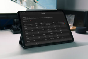
With this blog post, I’d like to introduce our idea of a real-time airport dashboard. As always, this is not intended to be a sales pitch for our product but to provide valuable insights. As mentioned, we discussed the below setup with different airports across Europe and tried to combine their requirements.
Airport Dashboard — The concept and what’s contained
The idea we follow with this dashboard is similar to our standard airline setup. We defined five areas of interest:
- Operations Radar
- Arrival & Departures
- Airport Details
- Provider Benchmark
- Weather
For each area, we set up one workspace containing various KPIs and different forms of visualization.
Airport Dashboard: Operations Radar
The Operations Radar provides the first overview of inbound and outbound flights. This workspace is very much similar to the one we provide to airlines. However, as airports acknowledged, it’s a perfect start to overview the current situation.

A set of most relevant KPIs accompanies the view. In the example above, we decided to show the number of departures alongside arrival and departure punctuality.
Nonetheless, in discussions with airports, it turned out that each airport had different requirements in terms of “most relevant KPIs.” Accordingly, the set of KPIs shown here could be exchanged with others, for example, the number of passengers, movements, etc.
Error: Contact form not found.
Airport Dashboard: Arrival & Departures
The Arrival and Departure view represents a very traditional yet super-important workspace. Very classically, it shows inbound flights on the left and outbound flights on the right. The flight information is enriched with details and colored according to delays or irregularities.

Additionally, the workspace provides six key performance indicators. Three of the KPIs focus on inbound (Arrival punctuality, number of arrivals, and number of arrival passengers), and three concentrates on departures (Number of departure passengers, number of departures, and departure punctuality).
Airport Details
We’ve already used a similar view for some airlines. However, it turned out that the view provides even more value to airports. What’s contained? First of all, the workspace includes information about each aircraft at the airport. Additionally, runways are colored according to NOTAMs (runway closure, reduced capacity, etc.) together with the current direction.

However, the most critical aspects —at least airports told us so— are shown as KPIs on the right side. So what we did here is to visualize the utilization of the most essential airport resources:
- Runways
- Gates
- Positions
For each resource, we calculate the current utilization together with the historicals and a forecast for the next hour. Then, based on defined thresholds, we color the utilization.
Airport Dashboard: Provider Benchmark
With the provider benchmark workspace, we focus on essential airport processes. For the moment we called, it Provider Benchmark — knowing that the process setup is different at each airport.
In that context, we defined the core processes for every airport:
- Towing
- Fueling
- Cleaning
- Catering
- Pax Bus
- De-Icing (seasonally)
For each of the processes, we display a Punctuality and Regularity KPI. Additionally, important notes, which can be triggered by the process responsible, are shown in this workspace.


Besides a total value, the screen can also show the development of the last 24 hours, for sure peeks or other timeframes.
Weather View
What’s more important in the world of aviation than the weather? Exactly, that’s why a detailed and comprehensive weather overview completes our Airport Dashboard.
The workspace highlights the specific airport and provides relevant information about a broader region (in our example Europe) and data for certain destination airports.

Conclusion
From a visualization point-of-view, our airport dashboard is not significantly different compared to our airline dashboards. Nevertheless, when it comes to the shown information and KPIs, it turned out (which wasn’t a surprise) that airports are focusing on slightly different information.
Personally, I think that especially resource utilization and provider performance provide a massive value when it comes to real-time monitoring.
What do you think? Always happy to continue the discussion. Hit me up on Twitter or get in touch with me on LinkedIn.