Passenger Connection Management — One Of The Most Complex Airline Processes
However, passenger management also reflects one of the most complex airline processes. That’s why an increasing number of airlines are trying to set up real-time dashboards that are tailored to passenger management. The underlying goal is to visualize passenger streams and related information. And to do that in a way that perfectly supports the passenger connection process.
However, after going down that road with airlines, we learned one thing. Passenger management (real-time) dashboards are everything but not trivial. The aspect that mainly drives the complexity is that additional and specific information is required to calculate the relevant KPIs. Nonetheless, this is of the highest importance to provide a valuable dashboard.
With this blog post, we provide a very practical case study. First, you will find visual examples of airline passenger management dashboards. Then, on top of that, we focus on relevant data required to set up those dashboards.
The Essential Information An Airline Passenger Management Dashboard Has To Contain
From our experience, a passenger (connection) dashboard should —first and foremost— visualize the passenger connection streams at a dedicated airport/hub. Therefore, it is essential to design a graphical visualization of these streams. This includes inbound flights, passenger connection streams, and corresponding outbound flights. Additionally, since this is the crucial KPI, the dashboard should contain the Misconnex Quota as the essential quality aspect of connection-driven airline operations.
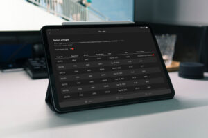
The airline passenger management dashboard below illustrates our approach to this topic. The connection visualization in the center of the dashboard highlights the following aspects:

The example shows Incoming flights, including the latest times and arrival gates on the left. The flights are accompanied by several connecting passengers (clustered according to compartments – first, business, premium eco, and eco). For example, for the flight at the top, three first-class passengers, nine business passengers, 17 premium eco, and 25 eco passengers connect to outbound flights.
The column in the middle of the visualization shows the number of passengers of a particular connection. Additionally, it shows the required and available transfer time. For example, nine businesses, 11 premium eco, and 12 eco passengers connect to an outbound flight for the first line. The required connecting time is 25 minutes, and the available connecting time is 20 minutes. Since the needed transfer time is higher than the available, those numbers are colored in red.
On the right side, the outbound flights are listed. As additional information, it shows the number of connecting passengers and the latest times and gate information.
What Kind Of Data Is Required To Set Up An Airline Passenger Dashboard?
Passenger Information
Obviously, the essential information to create an airline passenger management dashboard is about passengers. That means for each passenger, the dashboard requires corresponding inbound and outbound flight information. This information is typically provided by systems such as Amadeus Altea, Galileo, or Worldspan.
Latest Flight Information
To create an airline passenger management dashboard that provides valuable information, it is essential to have the latest flight information available. The most crucial data in this context is about the latest times:
- scheduled time of departure
- scheduled time of arrival
- estimate time of departure
- estimate time of arrival
- actual time of departure
- actual time of arrival
This, of course, is required for both inbound and outbound flights. Usually, this type of data is provided by the operations control system. Sabre Movement Manager, Netline, or AIMS are a few prominent examples. Since Operations Control Systems are typically the primary source for real-time dashboards, this information is usually already available.
Airport Information
Airport Information in this context is about up-to-date information concerning the arrival gate/position of the inbound flight and departure gate/position of the outbound flight. The source system for this information differs from airline to airline. Sometimes the data is provided by CRS, such as Amadeus. Sometimes the operations control system holds this information. In some cases, dedicated other systems have to be connected to the dashboard.
Connecting Times
Probably the most challenging type of information which is required to set up a passenger management dashboard. To highlight critical connections, it is essential to provide the needed transfer time for each combination of inbound and outbound flights.
Some airlines can only rely on very general connection times. For example, average minutes from one terminal to another. However, the value of a passenger dashboard sharply increases as the accuracy of this information improves. Some airlines operated dedicated systems providing detailed connecting times from one gate to another one. This also considers actual waiting times, Schengen/non-Schengen aspects, current infrastructure limitations, etc.
Nonetheless, a possible approach is starting with generic connecting times and continuously improving and detailing the figures.
What Do You Think?
How do you handle the topic of passenger management at your airline? Always happy to receive your feedback and thoughts. Just hit me up on Twitter or get in touch on LinkedIn.