Usually, they travel a lot, have minimal time, and have to be perfectly informed about their company’s performance.
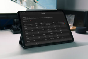
From our experience, we’ve observed that in most cases, executives use iPad (or other tablets) as the device of their choice, especially when it comes to reading documents and keeping them up to date with the latest company information. Based on that finding, we strongly advise to make sure executives can access a dashboard, including the most important key performance indicators as well as real-time operations information directly on their tablet.
However, when creating or designing dashboards for iPads and tablets, there are some essential aspects to consider. With this blog post, we introduce eight best tips you should consider when designing dashboards specifically for tablets.
Tip 1 — Make sure the iPad version of your airline dashboard uses multiple workspaces
The available space on tablets —in contrary to large TV screens— is very limited.
In order to still have a dashboard which delivers the message in an easy to digest form, it is crucial to separate your dashboard into several workspaces.
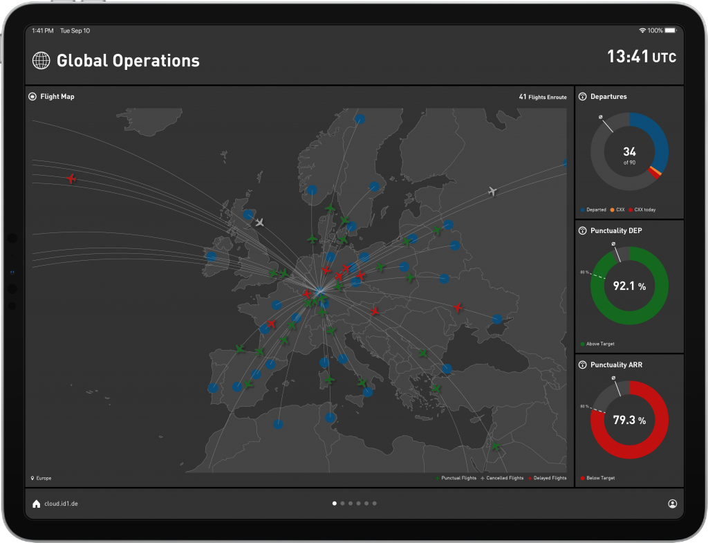
With our product —the aWall— we offer different workspaces that concentrate on one specific aspect at a time. For example, one workspace the focus on current flight status, one for airport information, one containing benchmarks, etc. Thus, providing the possibility to the executive to swipe through dashboard workspaces and understand the status of each aspect swiftly.
On the contrary, trying to squeeze all relevant information in one workspace most often leads to information overflow and distraction.

Tip 2 — Consistent design is key (actually not only for the iPad version of your airline dashboard)
Using multiple workspaces directly leads to the second tip: Make sure to apply a consistent design.
Create a design concept that defines colors, diagrams, fonts, and other design aspects before starting to prepare the dashboard. This, again, helps the executive to seamlessly browse through the dashboard instead of getting confused by different diagrams or colors.
Tip 3 — Reduce to the max
Probably the most complex task. Try to eliminate every information, every text, every graphic that is not necessary to deliver your message.
Again, executives don’t have time and space is limited on tablets.
That means you have to deliver information in a concise way — that, on the one hand, provides all necessary information but, on the other side, eliminates information that is not necessary and would lead to confusion and an increased time to get the message.
It’s a tough task since you have to sit down, think and decide which information really is required to provide a comprehensive situational awareness to the executive (and on the other side, which is not necessary).
Tip 4 — Highlight important aspects
One of the most crucial tips.
Develop the dashboard and contained workspaces in a way that important information gets highlighted.
With our product, we heavily use the potential of color highlighting. That means that important information —for example, if OTP is dropping, many flights are delayed, etc.— are colored in orange or red (depending on the severity).
On the contrary, if everything runs smoothly, the whole dashboard is more or less entirely gray.
By applying this tactic, the executive can understand in a split-second if operations runs as planned or not. They can quickly swipe through the dashboard. In case everything is gray, they immediately know that no further attention is needed.
In case several elements are orange or red, it’s probably time to dig a bit deeper.
Tip 5 — Use visuals
A graphic says more than 1000 words. And, additionally, a well-crafted graphic helps to deliver information much faster than 1000 words.
Therefore, try to use graphics whenever possible.
A dashboard that primarily contains text-based information isn’t a dashboard but a report. No executive has the time to read lengthy reports — especially when it comes to iPads/tablets.
Indeed, setting up graphics to deliver your information is more time-consuming, but —if done correctly— it’s a key driver to wow your executives.
Tip 6 — Make sure the iPad version of your airline dashboard includes relevant performance indicators
Every executive loves key performance indicators (KPI). Why? Because a KPI summarizes an entire aspect in one bold number/graphic.
With KPIs, executives don’t have to waste time trying to understand or read, but quickly get the essence of information. Due to that, you have to set up different KPIs that are relevant to your executives.
KPIs are the instrument that will definitely wow your executives — plain tables or text won’t.
If you want to get an overview of potential operations KPIs, you can check out our extensive KPI guide containing 77 operational KPIs.
Tip 7 — Use benchmarks
There’s only one thing executives love more than KPIs: Benchmarks.
Benchmarks naturally combine several KPIs in a condensed way and group them according to different dimensions. How’s the on-time performance of your Boeing fleet in comparison with your Airbus fleet?How’s the delay situation at your most important airports? And so on…
Especially on iPads/tablets —where space counts— benchmark views are a perfect method to provide a whole bunch of information, which are still easy to digest.

Tip 8 — Add detailed workspaces when necessary
Especially in case you are addressing executives from various business units, you have to make sure to enrich the dashboard for different user groups with additional —detailed— information.
For example, provide additional airport information for your VP Ground Ops, additional flight-relevant information for your Accountable Manager, or maintenance information for your VP Maintenance.
Nonetheless, it is important to make sure that those additional information/workspaces are only available for the dedicated executives.

Let’s wow your executives
With the iPad version of our product, we follow each of the eight tips, and from experience, I can tell you they really have the power to wow every executive.
If done correctly, executives quickly get addicted to your iPad dashboard. Give it a try!