Nonetheless, personal taste should never drive the design of an airline dashboard. Similar to data and KPIs, the design has to follow a profound method, clear strategy, and defined framework.
However, there are best practices to configure an airline operations dashboard. Therefore, we picked out four different dashboard use cases with this blog post. For each of the dashboards, we provide you with best practices and visual examples.
And in case you’d like to start with some design fundamentals first — you should head over to this blog post: 23 Visuals to Boost Your Airline KPI Dashboard.
Use Case 1: Strategic Dashboard
As part of a strategic airline dashboard, KPIs usually measure the overall company’s performance. Strategic airline dashboards aim to provide executives with a comprehensive overview. Therefore, it is essential to exclude details from the dashboard.
Best-Practice Overview
- Display more than one KPI for each corporate goal. This helps to provide a more comprehensive view regarding the current level of target achievement.
- Use performance indices that combine multiple KPIs into a single metric.
- Status lighting is extremely important. Executives don’t have time. Therefore, they have to understand the status in a split-second.
- Combining real-time and ex-post data is super-useful. Thus, you can provide both current status and development..
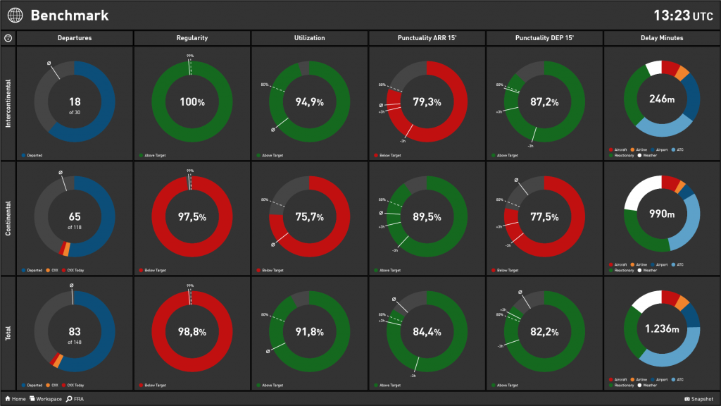
Example — Benchmark View
Based on our experience, the benchmark view works perfectly to visualize strategic aspects. A benchmark view combines a huge amount of information. However, when visualized correctly, it still understood swiftly.
Airline Operations Benchmark
Twitter Benchmark

Use Case 2: Tactical Airline Dashboard
Tactical airline dashboards aim to provide more details compared to the strategic one. It’s an ideal dashboard for middle management. Accordingly, it’s designed to enable proper decision-making processes and predictions. Naturally, tactical dashboards are business unit-specific and consider medium-term goals.
Best-Practice Overview
- With each workspace focus on one goal only!
- Provide details for each goal.
- Besides understanding the situation, your audience should be able to identify problems and issues.
- Tactical workspaces consider ex-post data in a medium-term period (typically a month to a quarter); real-time data can be used in addition to get insights into details.
Example — KPI Breakdown
A KPI breakdown typically starts with typically three KPIs on the left side. From left to right you can then use additional widgets to provide details. The below example (Twitter Topic Analysis) evaluates the success of the different topics an airline is tweeting about.

Use Case 3: Operational Dashboard Design
Operational airline dashboards provide a bunch of details. The overall goal is in enabling the viewer to monitor details. It is ideal for junior management and business departments.
Best-Practice Overview
- Status lighting is extremely important to visualize exceptions and alerts.
- The focus is on real-time data, which is put into context by ex-post information within 24 hours.
Examples
Summary/Detail Pattern
Our recommendation for operational workspaces is to use Summary/Detail-Pattern, In/Out-Pattern.

The Summary/Detail-Pattern provides a detailed overview of the operational situation. It uses large specialized widgets (e.g. flight map, airport map, or misconnex widget) next to a few KPIs that sum up the current situation.
The above airport operations workspace is a perfect example, focusing on runway, gate and position capacities as well as ground ops punctuality per aircraft at one particular airport.
Hub Operations Workspace
What comes in always has an effect on what should go out. Therefore, when looking at an airport, arrival-related data is typically displayed on the left side of the workspace and thus clearly separated from departure-related data (on the right side).
The effect is that a decline in arrival punctuality spreads across the workspace like a forest fire – if operations control doesn’t interfere. The Hub Performance workspace combines this In/Out-Pattern with Summary/Details-Pattern.

Use Case 4: Promotional Dashboards
Promotional workspaces are used to either provide information to customers or to strengthen the brand with well-chosen marketing figures.
It’s perfect for public areas. Besides the companies reputation and brand should be strengthened, thus creating a promotional effect.
Best-Practice Overview
- Don’t use status lights! They can result in negative customer reaction.
- As in operational workspaces, the focus is on real-time data that might be put into context by ex-post information within 24 hours.
Example
Our recommendation for promotional workspaces is to use Summary/Detail-Pattern

Also in public areas, the Summary/Detail-Pattern provides a lot of details next to few, well-chosen KPIs. The Public Area Twitter Monitor uses the principle to display current airline-related tweets on a large twitter timeline and adds some well-chosen marketing KPIs below.
Airline Dashboard Design — Special Tips
- Feel free to combine different workspace types in one channel, e.g. enrich a mostly tactical channel with a strategic benchmark.
- Don’t overload a workspace. Especially non-strategic workspaces should focus on one goal, topic, or object. This helps to make information easily accessible and correlations recognizable.
- Always reuse the same color for the same value.
- Use target- or trend-driven status lights to increase awareness and to guide focus.
- Keep in mind the overall view time of the channel. In most cases, a channel with four to eight workspaces is ideal.
What Do You Think?
Always happy to receive your feedback and thoughts. Just hit me up on Twitter or get in touch on LinkedIn.