Of course, not all of them want to access your corporate KPI solution. However, it shows the increasing relevance to provide KPI dashboards seamlessly on mobiles too.
I’ve already published a post about why I think mobile-first is the strategy to follow when setting-up KPI dashboards or solutions.
This article now summarizes 5 best practices that are often overlooked. However, you should pay attention to when developing a KPI App for airlines.
Airline KPI App — Get rid of your navigation bar or menu
Space matters, especially on mobiles. Mobiles are flats in the center of a vibrant city. Rents are super-high, and every pixel is expensive.
That’s why there’s no money or no space to waste with a constant menu or navigation bar.
And we need that space for other more important content.
It’s much better to rely on so-called hamburger menus — a small menu button at the top of your solution, which expands whenever needed.
Here’s an excellent example from Wikipedia’s mobile solution:


Probably, it’s even possible to avoid a menu completely and introduce an alternative navigation functionality (that’s what we do with our KPI apps).
Functions & Clickable Areas in reach
How often do you use your mobile? I guess, very often.
While waiting for the bus in the morning. While having the first coffee at Starbucks. And of course, in boring meetings. Maybe you reading this blog post on your mobile right now.
But much more important: How do you use your mobile? 75% sure, you’re using your thumb to navigate.
What does that mean? To provide a seamless experience for your user, you have to place the clickable content in an area easy to reach with your thumbs:

Putting the clickable content in the green area will massively ease the use of your solution
Reduce data size
True, KPI dashboards contain a lot of graphics. However, data volume still matters when it comes to seamless and
In case your mobile solution receives images to display, you have to take care, to reduce the size of the images as much as possible.
Of course, you still want to provide a high-quality image.
What we do alternatively: Our KPI Apps only receive XML or JSON data and render the KPIs within the app. Thus, we massively reduce the exchange data volume.
Responsive Design
This is so very important.
A solution, a KPI dashboard solution, which does not provide or support responsive design, shouldn’t be rolled-out anymore.
5 Recommendation when it comes to responsiveness:
- If you have to use graphics, offer tailored graphics for mobile usage, small in size.
- Define the layout and order of your content on smaller screens
- Think about animations — are they required on mobiles? Are they working?
- Think about videos — are they required?
- JavaScript is super-cool but does not always work on mobiles — at least as long your accessing your solution via browser. Think about developing an own app for your KPI solution.
Expandable Content
As mentioned, space is expensive. That’s why you should think about expandable content when designing your dashboard solution.
It helps to reduce the initially shown content and provides the possibility to your users if and when to expand additional content.
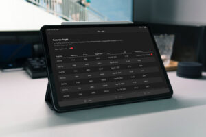
Airline KPI App — An Example
In our mobile solution — especially for airline operations KPI — we usually cluster KPIs in groups, which then can be expanded.