Since we set up aviation KPI dashboards at many airlines, airports, and ATC providers we had to learn many lessons. Based on these lessons and this experience we put together nine essential mistakes. Mistakes you should definitely avoid to make your aviation KPI dashboard project a successful one.
Let’s Rock ‘n Roll — Here Are 9 Mistakes You Have to Avoid When Setting Up An Aviation KPI Dashboard
#1 — Avoid too many KPIs on your aviation KPI dashboard
Yes, I know it’s tantalizing. There’s so much content you want to visualize. Department A requires some additional KPIs, and department B is currently focusing on some different KPIs. Oh yes, and the management wants to see the top 5 KPIs. And based on the available data, you could even calculate another seven additional KPIs.
Don’t get me wrong. Of course, it is brilliant if you’re able to provide all those KPIs and information. However, initially, you should focus on a minimal set of KPIs. It will help to reduce the overall risk of your dashboard project and many further mistakes tremendously.
And not to forget: It will provide the chance to continuously enrich your aviation KPI dashboard over the next months. This is so extremely important in order to maintain the
#2 — Information overflow
Tightly linked to the first aspect, a very prominent mistake is in providing too much information on one single dashboard. I’ve seen many aviation KPI dashboards, trying to squeeze as much information as possible in one view.
The result

Information overflow is an absolute killer mistake. Always keep in mind: Less is more. Try to have a super minimalistic approach. When setting up an aviation KPI dashboard, you always have to ask yourself:
- Which user group am I addressing?
- Which content do they need (Not which content might be interesting)
- How to reduce the content to deliver the critical message.
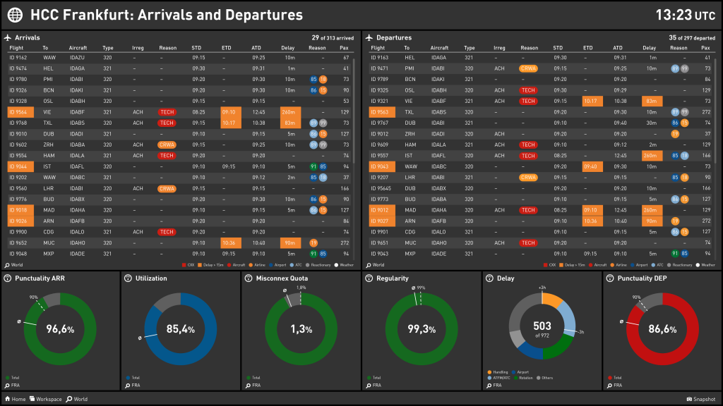
Here’s an example of a dashboard with focused and minimalistic information:

#3 — Unstructured aviation KPI dashboard
An aviation KPI dashboard has to follow two essential structure principles. The overall structure defines which and how many dashboards you are planning to develop. Dashboards should always focus on one specific business aspect or one question.
Within a dashboard, you have to have a clear KPI structure. For example, starting with high-level KPIs on the left side and providing more details on the right side.
Unfortunately, a lot of dashboards lack both of the above structures. They contain all KPIs which have been available in a visual way the work. Here’s an example for a dashboard without a clear structure:

And here’s one with a clear structure:
#4 — Too many different widgets
I know that many tools provide an endless list of widget types: Bar charts, donut charts, line charts — or even more fancy stuff like speedometers or batteries. A huge and common mistake is using too many of the available widgets. Very often, this leads to distracting the viewer massively.
Always remember, every visualization pushes a thought process with your viewer. And it is merely not evident for a viewer why the same type of KPIs are displayed differently.
Simple but important advice: Select a small set of widgets you want to use. Four to five should be more than sufficient to visualize everything you want on your aviation KPI dashboard. Advice number two: Stick with your selection and do not add additional widgets.
#5 — Outdated information / rarely updated
We are living in a real-time world. Wherever and whenever something happens in this world, we are informed immediately. This is something we assume in business too. And this especially accounts for the aviation industry and subsequently for an aviation KPI dashboard.
Nobody wants to look at an aviation KPI dashboard that is updated only once a week. In many areas (e. g. airline operations), even once a day isn’t sufficient. People are eager for updates. That’s why you have to pay attention to a continuous update flow of your dashboard.
#6 — Missing visualization
It’s true: It is not easy to develop a visualization concept for an aviation KPI dashboard. It is not easy to think about which widgets to use, which colors, which fonts, etc. And I think this is why some dashboards visualize available stuff.
I’ve seen many dashboards (although the word dashboard is wrong here), which incorporate pure text, an Excel file, and a Powerpoint presentation, which is updated once per month.
Frankly speaking, this doesn’t make sense at all. And since nobody will look at this “dashboard” after day one, you should not start in case you have such an approach in mind.
#7 — Hard to understand content and KPIs
A smaller mistake, however, is done regularly. You’ve developed a well-crafted dashboard. Clear structure, perfect visualization, but still, people don’t get the content.
Quite often, this comes along with two mistakes. Mistake one: Usage of too many abbreviations or specific wordings your target group does not understand. Mistake two: Content elements are lacking a description.
Good news: This is something you can fix. Here’s a detailed description of how to set up and design aviation KPIs.
#8 — No seamless integration
Nowadays, aviation KPI dashboards have to be available on every device. From large screens to pads and mobiles. It reflects a huge mistake to only concentrate on one device. You should read the full blog article about this topic: 3 reasons why mobile
# 9 — Poor data quality
Last on this list, but killer number one: The KPIs and information you are displaying on your aviation dashboard are wrong — or not in
Would Love To Get Your Thoughts On Aviation KPI Dashboards
Always happy to receive your feedback and thoughts. Just hit me up on Twitter or get in touch on LinkedIn.